Blogging for an adult public (not what you think)
Yeah. This post is about graphism and typography. I know. How disappointing.
Sometimes after 40 we all become presbyope. And most of us don’t want to hear about glasses, or delay wearing them as much as possible. So be kind to your older-ish readers and increase the legibility of your blog. It will also enhance whatever you have to say or show. A diamond needs a good setting, right ? Good, simple graphic design is the best setting for what you have to say.
Because I’m mean, and I need to have a little fun, I will only picture counterexamples, in French.
1. Reach higher contrast between background and text.
Open any book on your shelf. Open any magazine. Most are printed black on white, or very light paper. Legibility is all about the higher contrast possible between the page and the text. Do the same. Use colored fonts and background only for titles or notes. Think printing paper and post-it notes: colors are for the notes. I’m not saying that you shouldn’t use colors, I love colors. But for a page of text, use them sparingly.
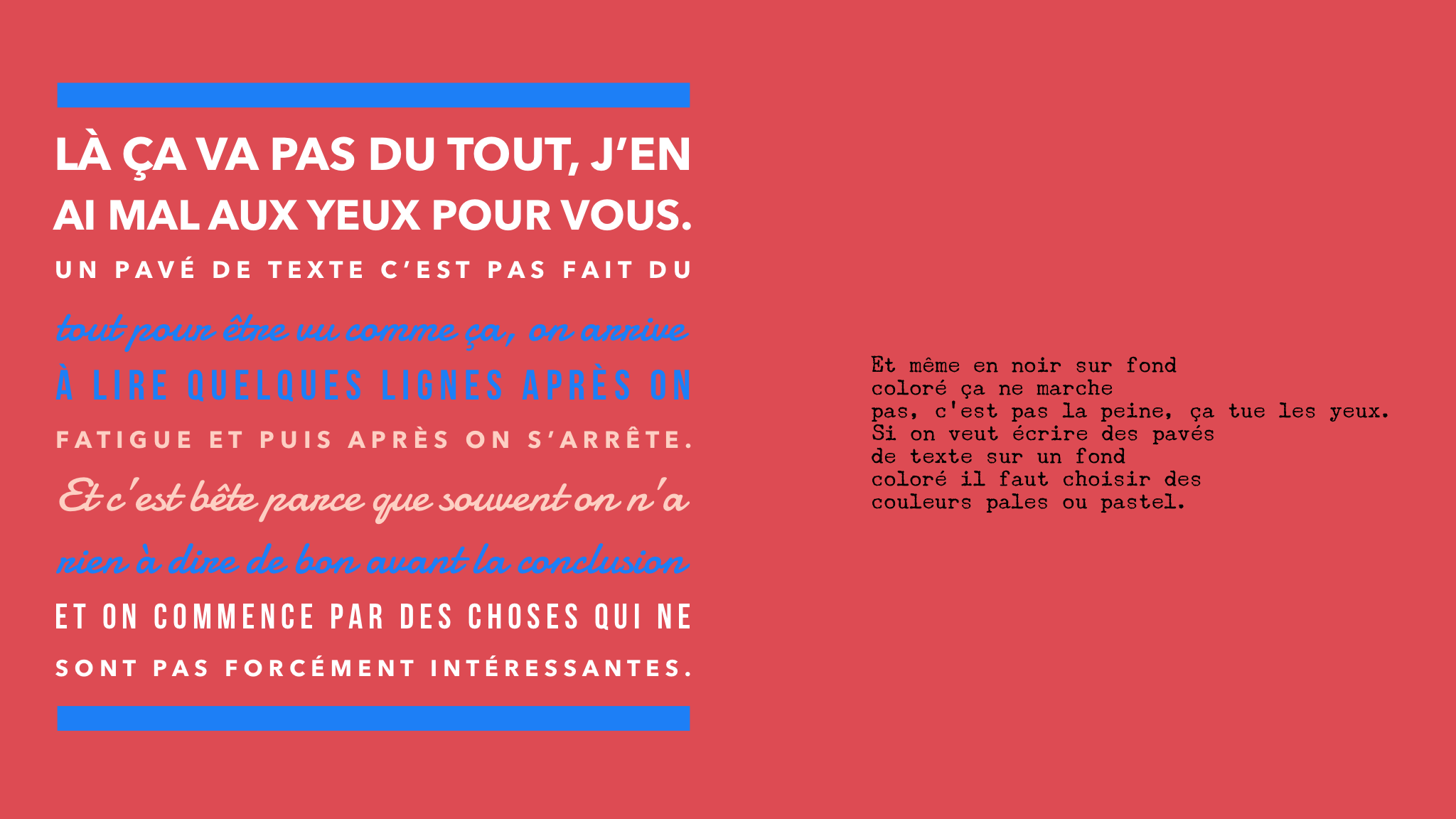
Another thing that is really tempting is to write on a background picture. Please don’t. Once again think of the post-it rule. Write block of texts black on white. Have fun with tiles, quotes, short sentences on pictures. But even for those, if the picture has a patterned or very contrasted background, it won’t be legible.

2. Use classic fonts for texts.
I will speak here only about text (body) fonts. For titles and inserts, use whatever you want, as long it’s either contrasting enough with the body font, or exactly the same font in a different grease or size. Try just to avoid using almost the same font, which is really not pretty.
I had to save the next paragraphs as picture, something you should always avoid, but to be sure the fonts won’t change with the blog parameters it was the best solution :

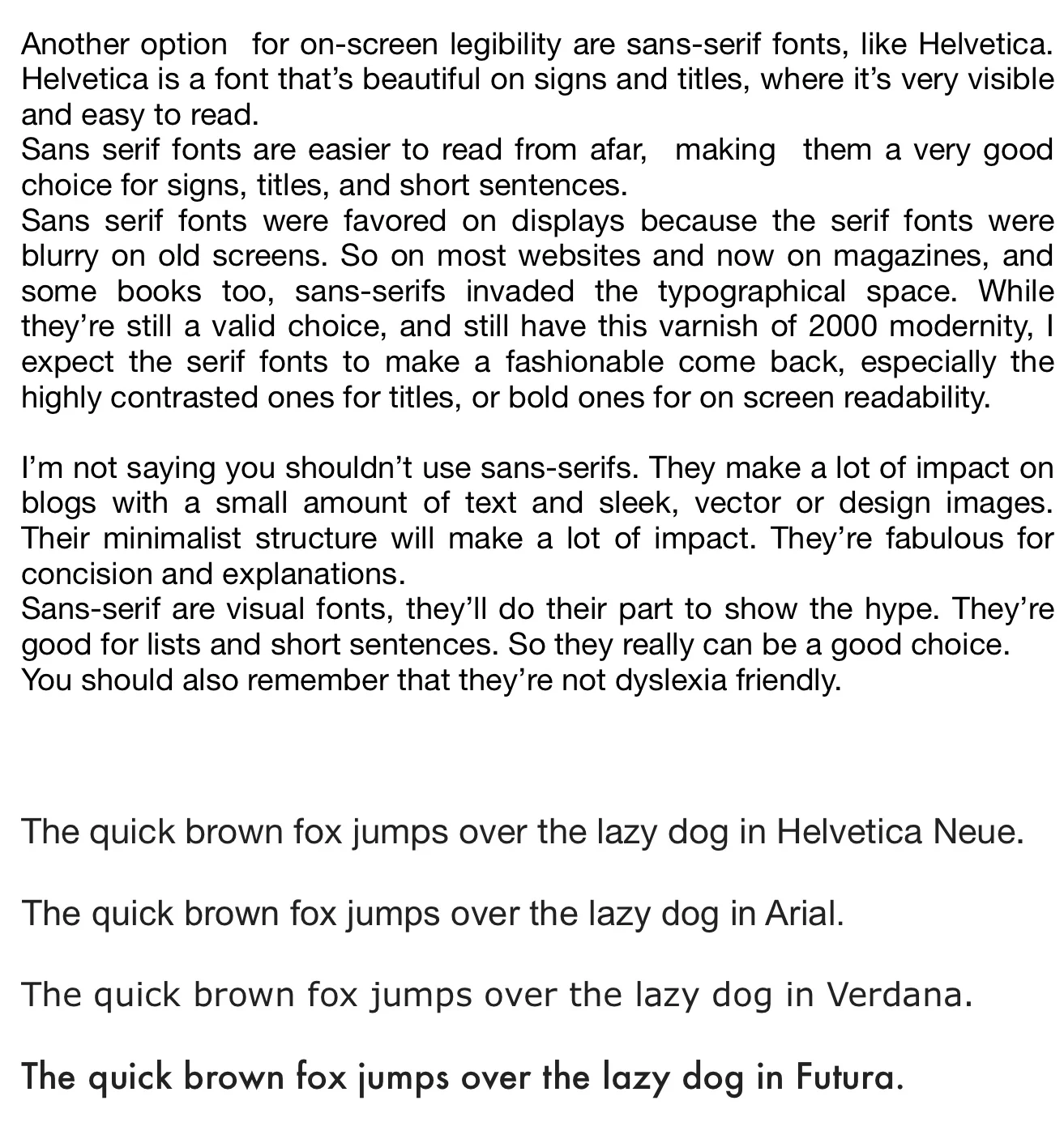
Whatever the font, try to find the right balance between contrast and size. I like Georgia for screen reading, but it’s a question of taste. Choose the size at the end of the day when you’re a bit tired, it’s the moment when your eyes are the less comfortable, it will help to choose a font with high legibility. Try the font on pangrams to see if you like all the letters, and on block of text to test legibility. Find the right size for on-screen legibility, between 13 and 18 for text ( body ) fonts. Anything under 13 might not be comfortable to read on modern, high resolution screens.
3. Balance margins and text blocks.
- Margins should be large, as large as you can. Tiny margins destroy readability. Plus, large margins are beautiful. Simply beautiful.
- Blocks of texts shouldn’t be too large. More than 75 characters on a line makes uncomfortable to read. Some blog templates (like mine) won't allow a strict measurement of characters, but if you can avoid larger blocks of text, please do. Think columns if you have a lot to say in one screen.
That’s it for the basics. There’s a lot of good typography blogs and books, don’t hesitate to read and learn more if necessary. In conclusion, I will give you my one rule for book design:
When in doubt, make it simple.
But don’t forget to have fun.
Conclusion, en français:
Suivez ces trois règles, et faites foufou sur le reste si vous voulez:
- Achevez le contraste le plus fort possible entre le texte foncé (noir) et le fond papier (très clair). Gardez les couleurs et le tagada pour les notes et les titres.
- Utilisez des fontes classiques très lisibles pour le texte.
- Faites de grandes marges et des lignes de moins de 75 caractères.
Pictures on this post were designed with the WordSwag app.