A brief introduction to color settings
There's 3 kinds of color settings in Photoshop. You will have settings that applies to the software itself and the way it displays pictures. You will already have some settings on the picture itself, or you can apply some in Photoshop. And then you will have the possibility to export your picture in a setting or another.
Weirdly enough, the way to change the color settings isn't the same from one Photoshop version to another. Please check your documentation for more information.Before doing any picture, check the settings (shift+command+K) or choose edit>color settings in newer versions, looking in the preferences for older versions. Choose according to your needs. For the internet, it's better to choose sRGB, even if some browsers like Safari are able now to detect a different profile.
I'm not really fond of SRGB, but I had to adapt myself to it because it's the default one in numerous applications (baaah). Then make a new picture according to these settings, or open a pre-existing one. Say yes when asked to convert to the new settings. Color will look different sometimes, it can even be a HUGE surprise. Correct accordingly. You a can also assign (dangerous) or convert (better) an opened picture to the new setting (look in the Edit menu to find these options). Photoshop has also a specific module for saving for web and devices (File > Save For Web & Devices)
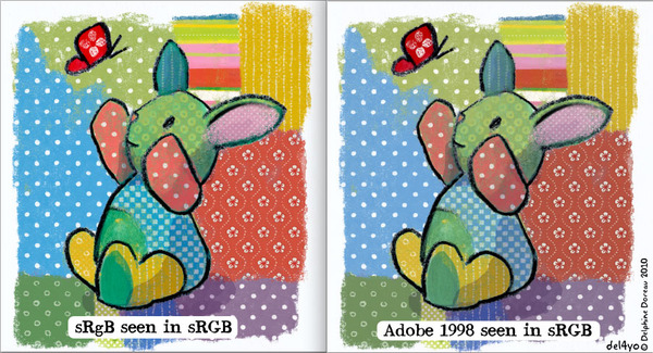
It's different in each version, but basically, look around until you have found the "convert to" and"saves as" sRGB option. It doesn't exist in all the versions. If you have an older version (pre CS3), make sure you converted your picture in sRGB first. If you don't pay attentions and build a picture in Photoshop with unadapted color settings ( like Adobe 1998 instead of sRGB for the net), then it might appear different on a media that accepts only sRGB. I learned it the hard way with Non Dairy and had also the problem with my first Moo Cards. It is important to make sure that, in and out, all your color settings match.
In conclusion, I recommend to ALWAYS check with your client what kind of color setting they need for the finished product. If the client doesn't know, choose sRGB by default, and ask for test prints if possible.
(dites si vous ne comprenez pas, demandez dans les coms, je ferais une traduction, mais la je n'ai pas le courage d'y passer les heures nécessaires, merci!)
